This guide refers to the new version of the Theme Editor that is currently part of a staged rollout. If you do not have access to this editor, see Theme Editor Sections for an overview of the Legacy Editor. Over time we will be extending access to the new editor to all users on non-legacy paid plans.
You can edit a theme, or create a new theme, either via the theme picker while you’re editing a survey, or via the theme library. Both actions use the same Theme Editor.
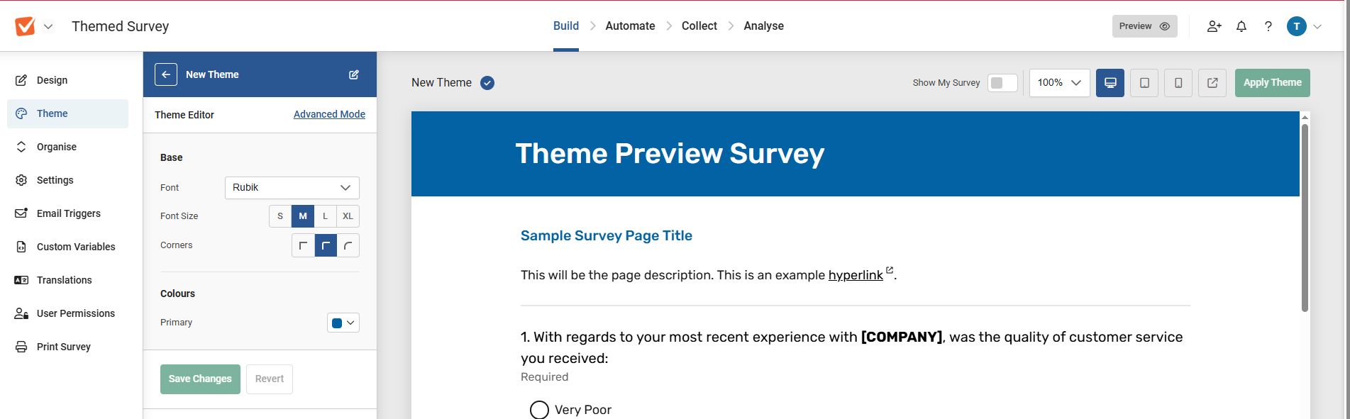
You’ll arrive at the Theme Editor in Standard Mode.
On the right, you'll see a preview survey and some preview options at the top. On the left, you'll see the main theme editor area.
Dynamic Preview Options
|

Any changes you make in the editor will be instantly reflected in the preview. There are some options for this preview.
- Show My Survey: (Only appears if you are accessing the editor directly from a survey, and not from the survey library.) Toggle this on to replace the default preview survey with the survey you're working on.
- Scale %: Zoom the preview in and out.
- Device presets: Quickly switch between desktop, tablet, and smartphone mode to see how your theme will look.
- Link to full preview: Get a full-page preview of the survey and theme with no UI.
These options are also visible if you're just selecting a theme, but the "Apply Theme" button is greyed out while you're editing a theme.
|
Standard Mode Editor
This allows you to very quickly choose a look for your survey via only a few options, explained below.
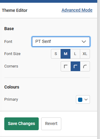
Base Options
- Font: Choose a font from the drop-down menu. You can also add a custom font by selecting “add custom font” and then entering a URL where it can be found and a family name for it.
- Font Size: Choose the size of text in the survey. This is not a specific point size, as some text elements are larger than others (the survey title will be larger than the question text, for example). Rather, it sets all the text types to be larger or smaller while retaining their relative proportions.
- Corners: Set whether buttons have rounded or square corners.
|
|
Colours
Choose a base colour for the coloured elements of the basic theme design – the survey title and the buttons. You can choose from a palette or directly enter a hex RGB value, making it easier to match branding specifications if you have them. Alternating rows of matrices will automatically be assigned a less saturated version of the same hue for consistency.
Just by using these four settings you can very quickly create a highly branded look for your survey, but some users will want to go further, and for that, there’s Advanced Mode.
Other Options: Some themes may have more options in basic mode than those described above. There may be more colour selections, or other elements. If you’re editing a theme in Basic mode and you see an option not listed above, check the “Advanced Mode” section below, where it should be described.
Advanced Mode Editor
|
You can activate Advanced Mode simply by clicking the link in the theme editor bar on the left. A warning will appear, which is important, so we will re-state it here:
Once you save the theme in Advanced Mode, there’s no going back to basic mode for that theme. You’re committed. This doesn’t affect other themes, but some changes that you can make in advanced mode will make the theme incompatible with the basic mode editor, so that’s why you won’t be able to revert.
|
|
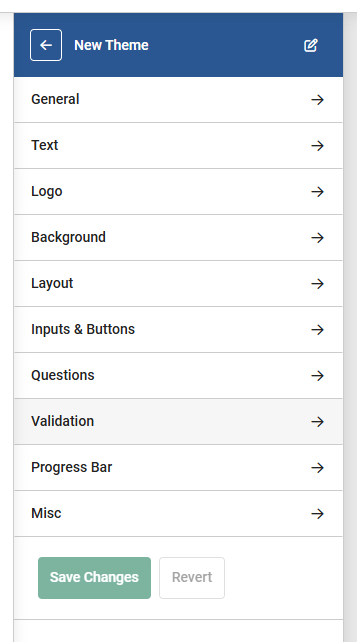
Advanced mode options
Advanced mode lets you change a vast amount of the theme’s styling, so there are a lot of options to use. These are split into ten editor pages, which this guide will go through in order. When creating a survey in this mode, it will also make sense to go through each of them in the order presented because of dependencies. You can navigate between the editor pages using the <> arrows in the bar.
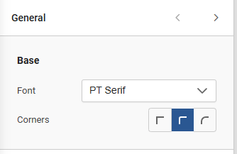
1: General
- Font: See Basic Mode description.
- Corners: See Basic Mode description.
|
|
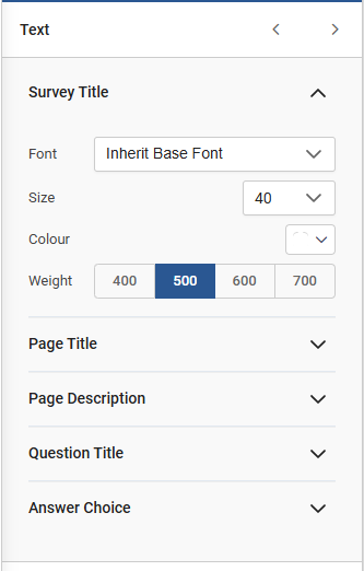
2: Text
|
This has subsections for:
- Survey Title
- Page Title
- Page Description
- Question Title
- Answer Choice
For each of these you can set:
- Font: If this is left on “inherit base font”, it will use the font set in the “general” settings. Alternatively, you can override this choice with a different font.
- Size (points)
- Colour: Again via palette or direct hex RGB entry.
- Weight: Choose from four possible weights of text for the font.
|
|
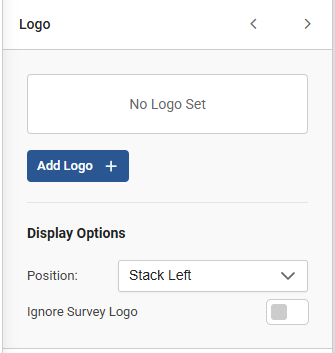
3: Logo
|
You can add a logo as part of the theme so you don’t have to use the Survey settings option to do it.
You can directly upload an image, or choose one from the file library, and set options for position. Setting "Ignore Survey Logo" to on means that any logo added via the survey settings won’t be used.
If this is set off, and a logo is set both in the theme and the survey, both will show.
|
|
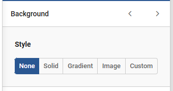
4: Background
|
This has 5 options:
- None
- Solid: Use the colour picker to choose a colour.
- Gradient: You can choose a start and an end colour for the gradient, and set an angle.
- Image: Upload a background image. When the image is chosen, there are extra options for positioning and size.
- Custom: Use your own CSS to do something fancy.
|
|
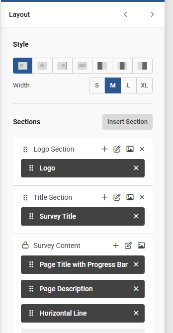
5: Layout
|
This is one of the more complex sections. In here you can control the style and section order on a survey page.
- Style – Set the overall layout for how the survey uses the width of the page using the icon buttons. If you have set a background on the previous page, the three options on the right allow you to put the background alongside the survey content when they are chosen and the "contain background" option is set.
|
|
Sections and Elements
The survey page content is made up of Elements, many of which are grouped into Sections. For each section you can change the order that some elements appear on the page, add elements, or remove elements. For instance, you might want to have the survey title as the highest thing on the page rather than the logo. Or maybe have two titles. Or extra spacing or lines, or maybe add some legalese to the footer.
For each section you can:
- Edit the Section: Set specific alignment, colour, width, corner, gap, and padding settings for that section only.
- Set Background: Set a specific background, with all the same options as the “background” editor page, solely for that section.
- Move an element: From the list, simply drag and drop the elements shown on the dark background via the six-dots icon. Some elements can’t be moved, and these will be shown with a padlock icon.
- Remove an Element: Use the cross icon next to the element name to remove it from the layout. Elements that can’t be removed won’t show the icon.
- Add an Element: Click the plus sign at the top of the content list to add a new element. Choose the type from the drop-down. Most of these are self-explanatory, such as lines or spacers. Custom Elements require a bit more explanation though.
Custom Elements
A Custom Element allows you to add your own HTML or CSS to the theme. Once you’ve added the custom element to the layout, click “edit” on the element in the list, and then add the code into the relevant box in the pop-up.
6: Inputs and Buttons
|
This is where you set how some of the more interactive sections of the survey – the inputs, buttons, and choices on questions – look to respondents.
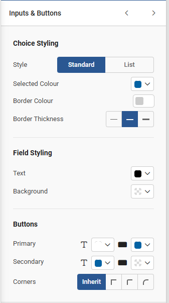
Choice Styling
Choose between two styles. Set whether multiple choice questions are presented with a blank circle next to them, which can then be clicked to “tick” them (“Standard”), or as a list on a background where, when selected, the chosen option will be given a highlighted background (“List”). You can set the colours of the background and the colour on selection (this defaults to the main colour chosen but can be overridden), and the thickness of the walls of the circle.
Field Styling
This sets the background and text colour for any free-text entry boxes.
Buttons
Set more detailed options for buttons, both background and text colours. Most buttons will use the “Primary” button style, but some (such as “previous page”) use the “Secondary” button style.
|
|
7: Questions
|
This sets how the questions themselves are presented.
Question Style
- Standard: No specific background style for the question.
- Legend Box: Puts a coloured box behind the question text.
- Floating Box: Puts a coloured box behind the question text and answer options / entry fields.
Options
- Question Separator: Switch on to add a horizontal line between each question.
- Gap: Manually set the spacing between the bottom of one question and the top of the next one. Numbers larger than 20 will make it bigger, smaller than 20 will make it smaller.
- Indent question text: Switch on to align the second line of question text so it starts at the same position as the first line, after the question number. Otherwise line 2 will start under the question number. This option will have no effect if question numbers are disabled in the survey settings.
Matrix
- Row alternating background: Switch off to remove the alternating colour background on matrices.
- Row border: Switch on to activate a border for each row of the matrix.
|

|
8: Validation
|
Sets options for validation and question requirements.
General
Colour – Set the colour used for displaying failed validation warnings, or on unanswered required questions.
Required Indicators
- Question: When a question is set as required, choose if this is displayed on the question with a word, an asterisk, or with no indicator.
- Option: Where options are required, set an asterisk or no indicator.
- Matrix row: Where a matrix row needs a selection, set an asterisk or no indicator.
- Show Row Error Text: Show whether an unanswered required row on a question is flagged on the specific row, or just the question.
|

|
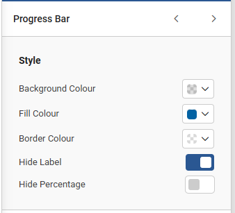
9: Progress Bar
|
Set colours for the progress bar, if one is active on the survey.
- Background colour: The colour of the "empty" bar – representing the portion of the survey yet to be completed.
- Fill Colour: The colour of the filled bar – representing the portion of the survey that has been completed.
- Border colour: Set a colour for the bar’s outline if one is desired.
- Hide label: Turn the bar’s label on or off.
- Hide percentage: Turn the display of the specific percentage of the survey that's been completed on or off.
|
|
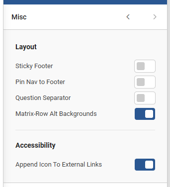
10: Misc
|
The final editor page, with some final settings.
- Sticky Footer: When active, the page footer will be placed at the bottom of the browser window (if the window is taller than the current page's question and answer content, plus nav and footer). When inactive, the footer will be placed immediately after the "Next Page" / "Complete Survey" buttons, after the final question on the page.
- Pin Nav to Footer: When active, the "Next Page" / "Complete Survey" buttons will be placed above the footer, instead of below the last question on the page. If "Sticky Footer" is off, then this won't do anything.
- Question Separator: Turn the question separator on and off. (This is repeated from the questions page.)
- Matrix-Row Alt Backgrounds: Turn alternating backgrounds on matrix rows on and off. (This is repeated from the questions page.)
- Append Icon to External Links: Add an arrow icon next to any hyperlinks to external sites to make it clearer that they link away from the survey.
|
|