The Summary Report will always show you how many responses a survey has, but the default display can be quite limiting, it being only a snapshot of the current state of play and with no visual element.
This guide will show you how to have your response counts shown on charts, so you can have more visual interest and see how responses have differed over time or perhaps from different sources.
Before we get started though, the methods described in the guide rely on the Default Answer feature as a minimum.
The Basics
To start with, we'll look at a method that will just track the aggregated number of responses. When charted, this will just give a single metric and will look like the below example:

Because “total number of responses” isn’t something that charts can show, and instead they visualise the answers to questions, what we’re going to do is use the "Default Answer" feature to create a question that every response will answer in the same way, and then hide the question using CSS so that the respondent can’t interfere.
- At the start of your survey, create a “Multiple Choice (Only One Answer)” question. Enter some question text (it doesn’t really matter what this is as we’re not showing it to respondents) and add a single response option, “Responded”.
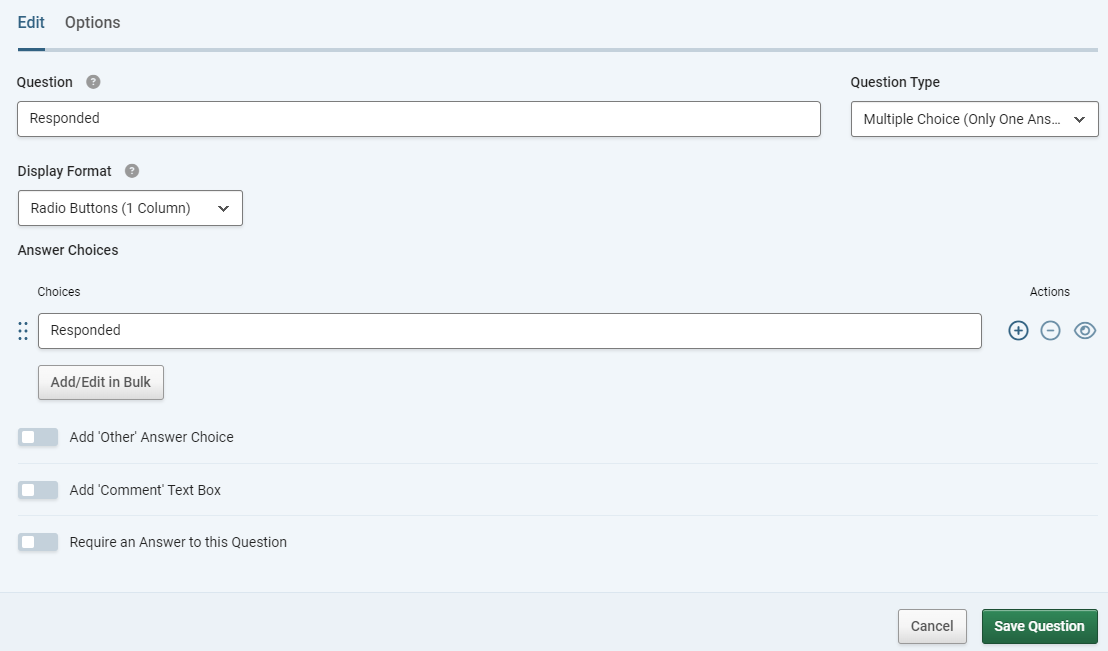
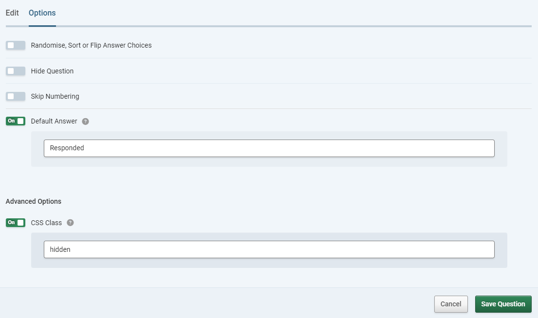
- Then, in the Options tab, set the “Default Answer” toggle to On, and enter “Responded” in the default answer box.
- Next, on on the same tab, set the “CSS” toggle to On and enter “hidden” in the box. Do not click the “Hide Question” toggle.
- Save the question.
And for the basic implementation, that’s all you need to do. You can now edit the Chart settings for the new question in the summary report to display this data however you like, as a bar, or column, or even a trend chart to see how responses have changed over time. For space, we won't go into that part in this guide as it;s all the same as for any other question. For more details on creating and editing charts, go to this guide: Creating Charts From Survey Results.
Advanced: Chart By Tracking Link Source
So for this example we’re going to imagine that we want to look at how many responses some different traffic sources are sending to our survey.
The end result here is going to allow for charts with multiple bars or lines, meaning the sources can be compared.

The method here is very similar.
- To begin, create a tracking link for each of the traffic sources coming to your survey. Ideally these should have names that are descriptive but not too long. It will be helpful to make a note of all the names in a text file.
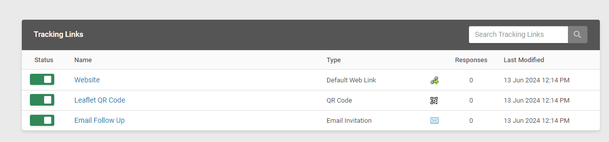
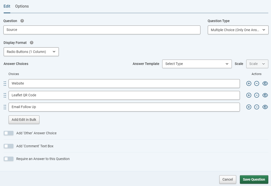
- At the start of your survey, create a “Multiple Choice (One Answer Only)” question. Enter question text , in this case it’s most appropriate to use ”Source”. Add the names of all your tracking links as the answer options. NOTE – it is essential that these options match EXACTLY your chosen names for the links.
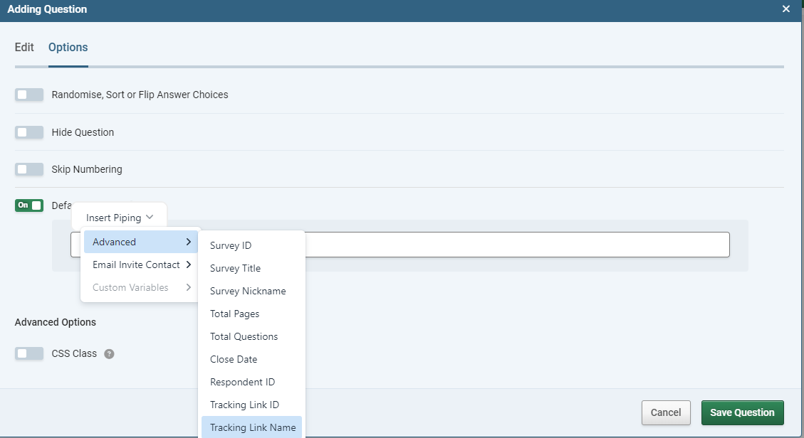
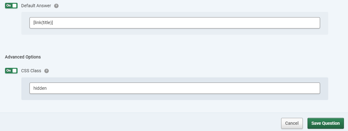
- Then, in the Options tab, set the “Default Answer” toggle to On, and then click "Insert Piping" then select "Advanced" > "Tracking Link Name". Alternatively you can manually type "[link(title)] in the default answer box.
- Save the question.
- At this point you should test the survey by accessing it via all of your tracking links to make sure that each one picks up the right option on your “source” question. You don’t need to complete a response, just load the survey and view the question.
- If your testing is all OK, go back to the survey editor, edit the question and on the options tab, set the “CSS” toggle to On and enter “hidden” in the box. Do not click the “Hide Question” toggle.
- Save the question again.
And again, you’re all set. Just need to set up your desired visualisation options via the chart settings for your new question.
Advanced 2: Chart By Custom Variable
One alternative is not to use the tracking link but instead base the chart on a custom variable. This has some up sides and down sides. The advantage is that you don’t have to create lots of tracking links. The disadvantage is that so a response can be correctly logged when it comes in, your “source” question needs to already have options for all the possible values of the custom variable. This may or may not be practicable. The method itself is almost identical to the previous one:
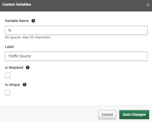
- To begin, create a custom variable for the traffic sources coming to your survey. Give this a name and a label. In this example we’ll use “ts” as the name and “Traffic Source” as the label.
- At the start of your survey, create a “Multiple Choice (One Answer Only)” question. Enter question text, in this case it’s most appropriate to use ”Source”.
- Add the possible values of the variable as the answer options. NOTE – it is essential that these options match EXACTLY the possible values of the variable.
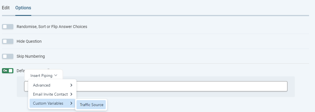
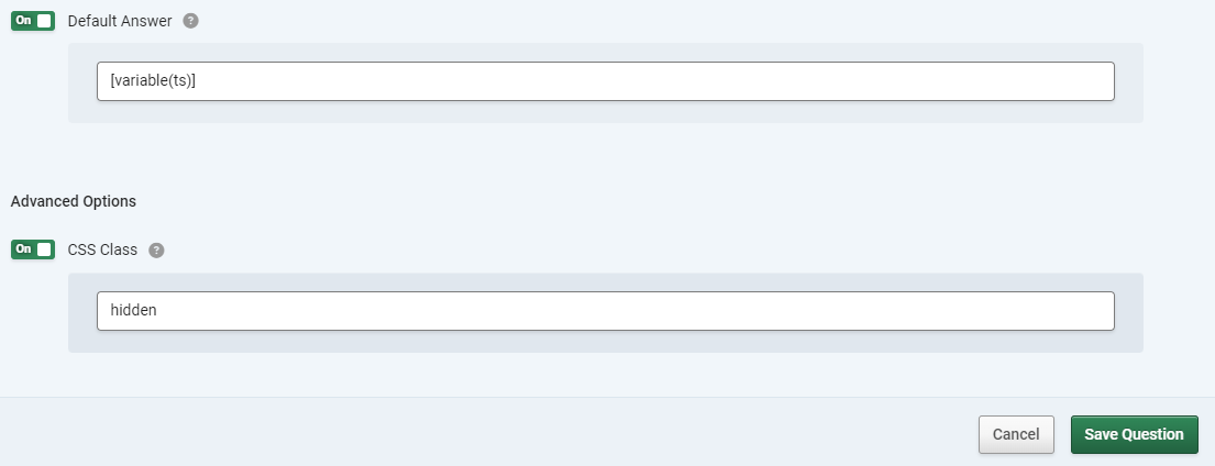
- Then, in the Options tab, set the “Default Answer” toggle to On. Click "Insert piping" and select "Custom Variables" > "Traffic Source" (or the label you chose for your variable). alternatively, if following the example, you can enter “[variable(ts)]” in the default answer box.
- Save the question.
- At this point you should test the survey by accessing it with URLS using all the possible variable values to make sure that each one picks up the right option on your “source” question. You don’t need to complete a response, just load the survey and view the question.
- If your testing is all OK, go back to the survey editor, edit the question and on the options tab, set the “CSS” toggle to On and enter “hidden” in the box. Do not click the “Hide Question” toggle.
That’s it. Set up your desired visualisation options via the chart settings for your new question.