In July 2021, The new charts system became the default for all users, though users can still switch back to the old legacy system if desired.. For information about using Legacy Charts, click here
Charts are now part of the Views system – when you change any element relating to a chart, that setting will be saved when you save a View, and applied when you load that View.
Generating Results Charts
The Charts tool now allows you to create highly customised charts to visualise your data.
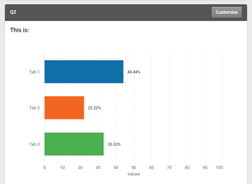
To access the charts tool, go to the “Analysis” Tab of your survey. For any question of a type that can show a chart, a default bar chart will be displayed. To change the chart, click the “Customise” button in the upper-right of the box:
Clicking the Customise button will open the chart options, which are on two tabs:
General:
Chart Types
Choose from the following:
|
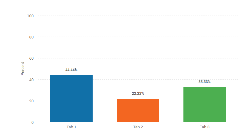
Bar
|

|
A straightforward chart showing each answer value as a horizontal bar, with length in proportion to the received answers.
|
|
Column
|
|
Chart showing each answer value as a vertical column, with height in proportion to the received answers.
|
|
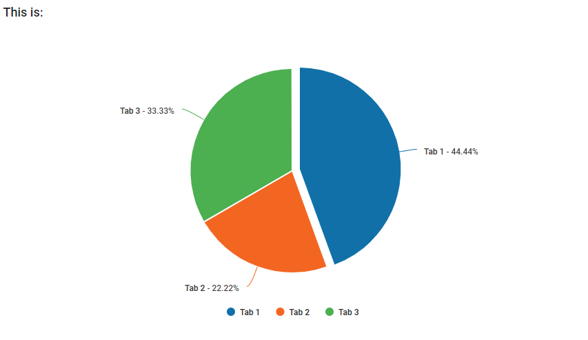
Pie
|
|
The classic pie chart where each value is displayed as a proportion of a circle, which represents all the responses to the question. Segments / slices can be clicked to bring them out of the circle for emphasis.
|
|
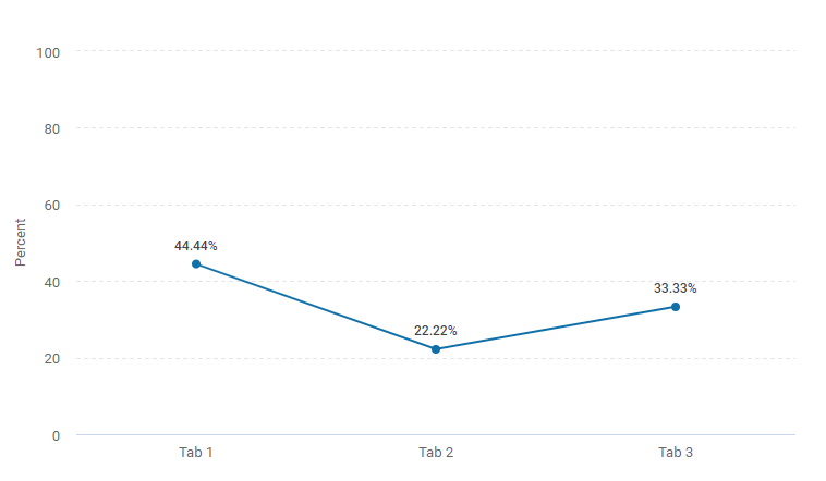
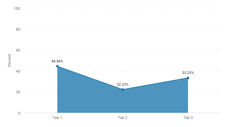
Line
|
|
The data is shown as a series of data points, with the options on the X-axis and the values as the Y-axis. The points are connected as a line.
|
|
Area
|
|
Similar to the line, except the area below the line is shaded.
|
|
Stacked Column
|
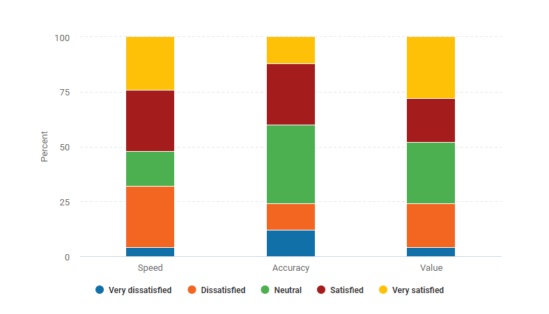
|
The answers are displayed as sections of a column, in proportion to the received answers. For matrices, each row is shown as a separate column.
|
|
Stacked Bar
|
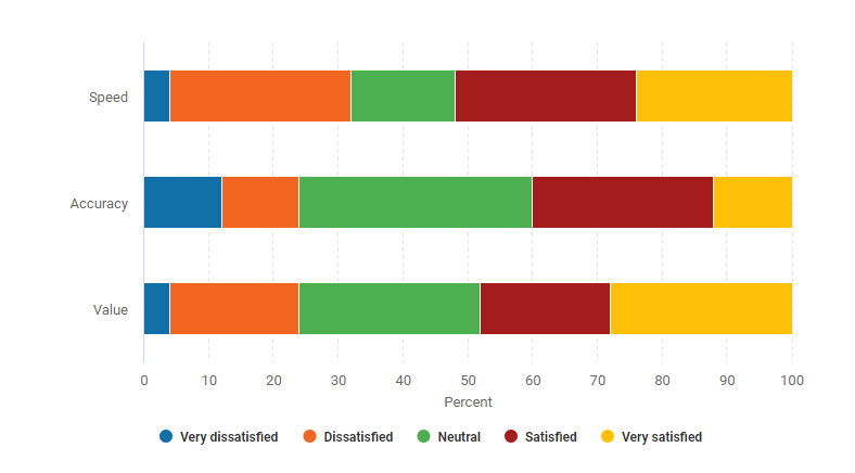
|
The answers are displayed as sections of a bar, in proportion to the received answers. For matrices, each row is shown as a separate bar.
|
Question Text
You can set whether the question text is included on the chart, and also you can edit the text (for example, if a shortened version would be more useful)
Display Options
The section includes more detailed options for customising the appearance of the selected question.
| Chart Colours |
Toggle the data elements of the visual between having their own colours and all being a single colour |
| Data Table |
Toggle the table with numerical data under the chart (if shown) on and off |
| Data Table Bar Chart |
Include a simple bar chart as part of the data table |
| Data Table Bar Chart Colours |
Toggle the simple bar chart elements to have their own colours, or all be one single colour |
| Response Breakdown |
Toggle data on how many respondents answered the question and how many skipped it |
| Axis Scale |
Change the Axis Scale to either be shown by either a percentage or the number of responses collected. There is also a Revert to original button that will reset your Axis Scale settings |
| Decimal Places |
Set how many decimal places are displayed for the results values. Affects both the chart and data table |
| Labels |
Set which Data Labels are included on the chart. Toggle Percentage, Value, and Answer Choice (Pie only) |
| Legend |
Add a legend explaining which colour of the pie chart represents which option |
| Tooltip |
Toggle whether a tooltip containing extra data will appear when the mouse pointer is hovered over a chart element such as a bar, point, or segment |
Answer Choices
| Hide answers with 0 responses |
Removes any answer options that weren't chosen by any respondents. This option means that as answers recieve responses they will appear in your charts automatically
|
| Hide Answer Choices |
Specify the answer options you'd like to hide from your chart. Answer choices remain hidden until they are unhidden. Clicking on "Eye" icon will do this
For some charts results are recalculated, find out more here
|
| Answer Choices |
Use the text boxes to amend the wording used for answer labels. You can also change the specific colours each element has ion the drop down menus located between the answer labels and hide icon |
Net Promoter®, ENPS, Customer / Employee Effort, and Customer / Employee Satisfaction Questions: These questions have dedicated chart types and are documented in the Net Promoter Score, ENPS, Customer Effort Score, Employee Effort Score, Customer Satisfaction Score, and Employee Satisfaction Score Guides.
Legacy Charts
Turning survey results into charts allows you to create visual representations of your data which can be incredibly useful when analysing statistics and presenting results in reports.
Generating Result Charts
- Go to the Analyse page of your survey
- Click Add Chart next to a question with the create chart option - this generates a chart showing the respondents answers
- Use the Chart Type menu to change the type of chart
- Click Display Options to change chart colours, setup what appears in your tool tip when you hover over elements of the chart and much more! The chart will dynamically change as you edit it, allowing you to see the changes being made in real time and adjust accordingly
- Hovering over the chart itself, you'll see 3 bars appear in the top right. This menu will allow you to preview the chart in it's current form in full screen, print the chart, or download it in one of the following formats: PNG, JPEG or SVG Vector image
Chart Types
Chart Settings
| Includes |
Choose whether to show the values for all possible choices or whether to include only the top 2, 3, or 4 options. If chosen, the other responses will be grouped together as a single bar / Column / Point / Slice |
| Group Remaining As |
Give a name to the Others group when not all choices are being displayed. Default set to Others |
| Chart Title |
Choose whether to display a title on the chart or not. If the title is displayed it can be changed. By default this is the question text |
| Data Labels |
Choose whether your chart labels show the raw number of responses (Values Only), their proportion of all responses as a percentage (Percents Only), or both (Values & Percents). Default set to Percents Only
|
Exporting Charts for External Use
The charts can be saved directly from the chart editor by clicking the three lines icon in the upper right of the chart window. this will let you save the chart directly to PNG, JPG, PDF, or SVG formats.