What is TURF Analysis?
A TURF analysis is a method for finding the combination of responses that covers the greatest possible proportion of your responses.
Why might you want to do this? Let’s say you’re working for a company that makes and sells some sort of physical product, and you’re looking at sorting out your new releases for next year. You have loads of ideas for products, but you’ll only have the capacity to make 3 of them. Which ones do you pick?
The simplest approach would be to offer them up as options in a survey and pick the top 3 responses by the number of times they were chosen, but this can be misleading. If it’s all the same people choosing that top three, then when it comes to sales, then you run the risk of cannibalising yourself – your product offering as a whole may be competing for the same people and disregarding others.
So, what’s needed is an output that shows the combination of options that covers the greatest possible proportion of the respondents so your offering can address as much of your market as possible. This is a TURF report.
TURF is an acronym standing for Total Unduplicated Reach & Frequency. "Unduplicated" being the key word - we want to minimise the amount of duplicated respondents in the choices we make.
Using TURF Analysis
 TURF Analysis is available on our Full Access plan and you'll find it on the left-hand side of the “Analyse” tab in the Results section of your survey.
If you click on it, you’ll get to the TURF Analysis tool. This is simple to use as there are only three or four options.
The First drop-down menu is a list of all the eligible questions on your selected survey. Currently, this is only “Multiple Choice, Multiple Answers” questions, but this may be added to over time.
The next option is to choose a filter to apply before performing the analysis. This will only appear if you have filters on the survey you're analysing.
Next option is the “Simulation Level”. Put simply, this is the number of options out of the available ones on the question that you want to be selected. So, if you want the analysis to find the combination of 3 options that cover the greatest proportion of all the available respondents, then choose 3. The maximum number for this setting is 5.
The final option is a tick box to add an AI Summary to the results. This is just an AI-generated explanation of the outcome of the analysis after it runs.
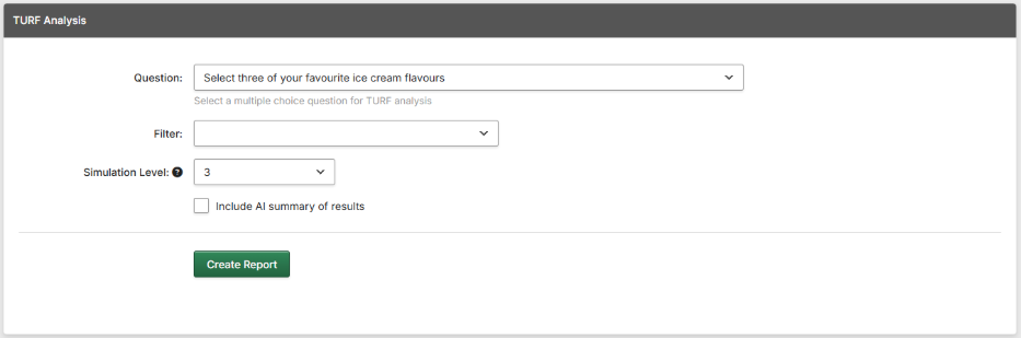
Click “Create Report” to run the Analysis.
Viewing the Analysis.
The Analysis uses a “Greedy Stepwise” algorithm to find the maximum coverage of respondents for the desired simulation level. The Output shows the steps taken, how much each one added to the coverage, and the total coverage after taking that step, as a total percentage and as a number of respondents.
The bottom row of the table shows the last step, which will be the combination with the best coverage of respondents for the simulation level you chose.
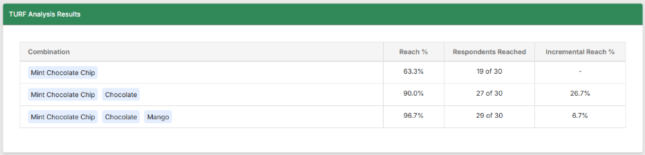
In the above example, we can see the steps taken. Mint Chocolate Chip was the most popular option (row 1). Then adding Chocolate gained us another 8 respondents who hadn't selected Mint Choc Chip. Finally, adding Mango got us another two who had not picked either previous option, for a total of 29 out of 30. This means that if this was our range of ice cream, then 29 out of 30 of our respondents would be offered something that they wanted.
Below this, the AI Summary will, if selected, offer a narrative explanation of the report.
Using the AI Summary does not use up AI Credits